
biBerk - My Account
Improving the online Policyholder Experience for small business owners
Unifying the Policyholder Experience
At biBerk, an online provider of small business insurance, our steadily growing customer base brought with it an increasing need for a more modern and intuitive way for policyholders to manage their coverage. While our online quote workflows made it easy for customers to buy the insurance they needed for their small business without ever having to speak to an agent, the same wasn’t always true once their policy was active.
Essential policyholder tasks like making payments, submitting claims, requesting changes to and accessing important documents were all accesible online. However, every task was under its own disparate login, which required users to re-enter their phone number and policy number any time they wanted to complete an action on their policy. These varying experience created friction, confusion, and an uptick in support calls. Bluntly stated: we were falling short of user expectations. While we promised on a fully touchless solution to small business insurance, we weren’t living up to that in all areas of the policyholder experience.
To address the growing gap between user expectations and our existing tools, we set out to build My Account: a centralized, single-login hub where customers can easily view and manage all of their policies, download documents, update details, make payments, and submit or track claims — all in one cohesive, touchless online experience.

Design Process
The problems with our policyholder functionality had been clear for some time. The My Account project was originally planned before I joined the team, but budget restrictions forced us to postpone it. Soon after I started, the project made it onto the UX team's roadmap, and I took ownership. Inheriting some old designs from another designer in Adobe XD (the company had since switched to using Figma) I initially started design for the project by widely iterating through wireframes, maintaining the core information architecture (coverage, claims, documents, payments, account) while refining the layout, navigation, and overall usability. After much exploration, collaboration, and refinement the final wireframes were translated into higher fidelity mockups using a PrimeNg Component Library and Design Tokens. These designs were then prototyped and reviewed across product and engineering terams to validate flows and functionality before moving into development.
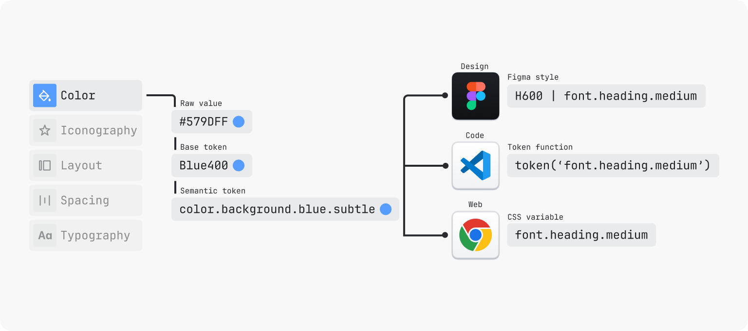
Utilizing Components and Design Tokens to Improve Development
Utilizing Components and Design Tokens to improve Development
As part of the development phase, I worked closely with engineers to ensure that the My Account designs translated seamlessly from Figma into code. All designs were built using components and design tokens, which are essentially variables that encode design decisions — such as colors, spacing, typography, and interactive states — so they can be consistently applied in the codebase. By leveraging Figma’s Dev Mode, developers could inspect which tokens were applied to each component and easily implement the same values in code. At the same time, they were using our PrimeNG component library, which was already linked to the same token structure, allowing for a highly consistent visual language across the product. This approach significantly reduced development time, minimized questions about styling or which classes to apply, and decreased back-and-forth between design and engineering. Overall this process resulted in faster implementation and a more cohesive, polished final product.

Outcome
Although My Account has not yet officially launched, we are preparing for a phased release beginning with a beta group of 100 Commercial Auto policyholder before rolling it out broadly across all policy types. The launch strategy will allow us to closely monitor the user experience, validate or invalidate our assumptions, and squash any last minute bugs that arise.
With the release of My account we aim to meaningfully improve the policyholder experience, and significantly decrease the volume of support calls. To measure our success we’ll continually monitor the experience through analyitics and user research. Through FullStory we have set up comprehensive tracking to capture user behavior, conversion paths, and common drop-offs. Supported by the analytics and session replay that FullStory provides, we will also conduct user interviews to measure how well the improved experience meets policyholder expectation and identify improvement opportunities for future iterations. With this foundation, My Account is positioned to become the central touchpoint for policy management and a core differentiator in our overall customer experience.