
biBerk - PrimeNG Design System
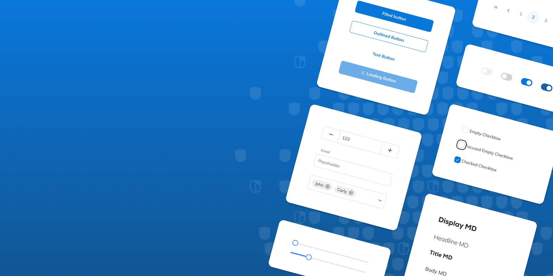
A centralized token-driven design system to establish a consistent, scalable foundation for product design and development.
Unifying a Fragmented Product Ecosystem
At biBerk, our growing suite of digital insurance products had evolved rapidly over time. As the company expanded, multiple customer-facing workflows and internal tools were built across different tech stacks and at different stages of growth.
As both our insurance offerings and our user base expanded, it became increasingly difficult to scale and maintain a consistent user experience across products. UI components and interaction patterns varied between applications, design decisions were often undocumented, and developers frequently relied on one-off fixes or custom implementations to solve immediate problems. Without a centralized source of truth for design, collaboration between design and engineering became slower and more fragmented, requiring significant back-and-forth during implementation.
To address these challenges, I led the creation of a unified PrimeNG design system powered by design tokens. Our goal was to establish a scalable component library and shared visual language that could:
- Consolidate design patterns across products
- Improve consistency and maintainability of all products
- Increase brand trust through a unified visual language
- Streamline our design and development workflows

Building a Scaleable Design System
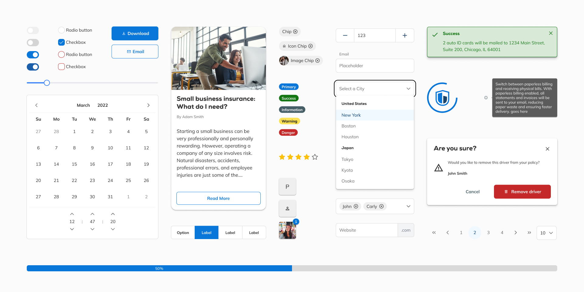
After evaluating several approaches, we chose to build our system using PrimeNG. PrimeNG provided a mature and highly customizable component framework built specifically for Angular. This aligned well with our existing architecture since our largest internal platform and many associated customer-facing workflows had already been developed in Angular. In addition to reducing implementation overhead, PrimeNG integrated cleanly with a token-driven workflow, making it a strong foundation for a scalable design system.
Before creating the design system itself, I first worked to establish a foundational set of design decisions that could scale consistently across products and platforms. This process started at a subatomic level by defining shared typography styles, spacing values, color palettes, elevation styles, and other foundational UI properties. Using Tokens Studio within Figma, I then organized these decisions into a structured token system consisting of both primitive tokens (raw values such as colors or spacing units) and semantic tokens that could be mapped to specific UI purposes and component states.
Using the downloadable PrimeNG Figma library as a starting point, I worked through components individually and applied component-level tokens to create reusable, scalable UI patterns. This included defining tokens and behaviors for states such as hover, focus, disabled, and responsive breakpoints. Throughout the process, I collaborated closely with other designers to review patterns, refine usability, and consolidate inconsistencies that existed across products.
The end result was a fully centralized Figma component library available to all designers across the organization. One of the most impactful aspects of the system was the flexibility enabled through token themes. By applying different token sets to components or entire artboards, designs could automatically adapt between breakpoints or switch between light and dark themes without requiring components to be manually redesigned. This dramatically improved scalability and allowed the design system to support multiple products and future use cases far more efficiently.

Bridging Design and Development
A major goal of the PrimeNG design system was not only to improve UI consistency, but also to create a significantly more efficient workflow between design and engineering. To accomplish this, I worked closely with our UX developer throughout implementation to ensure that the tokens defined in Figma were correctly mapped to corresponding CSS variables and classes within the PrimeNG component library in code. This collaboration allowed both designers and developers to work from the same shared system rather than maintaining separate interpretations of component styling and behavior.
To further strengthen this workflow, we transitioned our design handoff process away from Zeplin and into Figma Dev Mode. Rather than inspecting static measurements or raw pixel values, developers could now view the exact tokens, variables, and component configurations being used directly within designs. This reduced ambiguity during implementation, simplified communication between teams, and made it significantly easier for developers to build consistent interfaces without requiring repeated clarification from design.
All shared components were also documented and housed within Storybook, creating a centralized reference point for both designers and engineers. This gave teams a reliable source for reviewing component behavior, states, and implementation patterns while helping ensure consistency across projects. As the design system continued to expand, I remained closely involved with both developers and fellow designers to refine components, solve edge cases, and evolve the system alongside the needs of the business. Rather than functioning as a static library, the design system became an actively maintained product that continuously improved how teams designed and built experiences across the company.
Outcomes
The PrimeNG design system has since become the centralized foundation for how digital products are designed and developed at biBerk. A full component library was created and integrated with design tokens, allowing both designers and developers to work from a singular source of truth for visual and interaction patterns across products. By connecting tokens directly to components in both Figma and code, updates to typography, spacing, colors, and other visual properties can now be managed centrally by a designer without requiring developers to manually revisit individual component implementations or maintain custom CSS overrides.
The adoption of Figma Dev Mode also significantly improved the handoff process between design and engineering. Rather than relying on raw pixel values or external tools like Zeplin, developers can now inspect the exact tokens and classes used within designs and apply those same variables directly in code. This streamlined collaboration reduced ambiguity during implementation, decreased design QA overhead, and led to measurable improvements in development speed and delivery timelines.
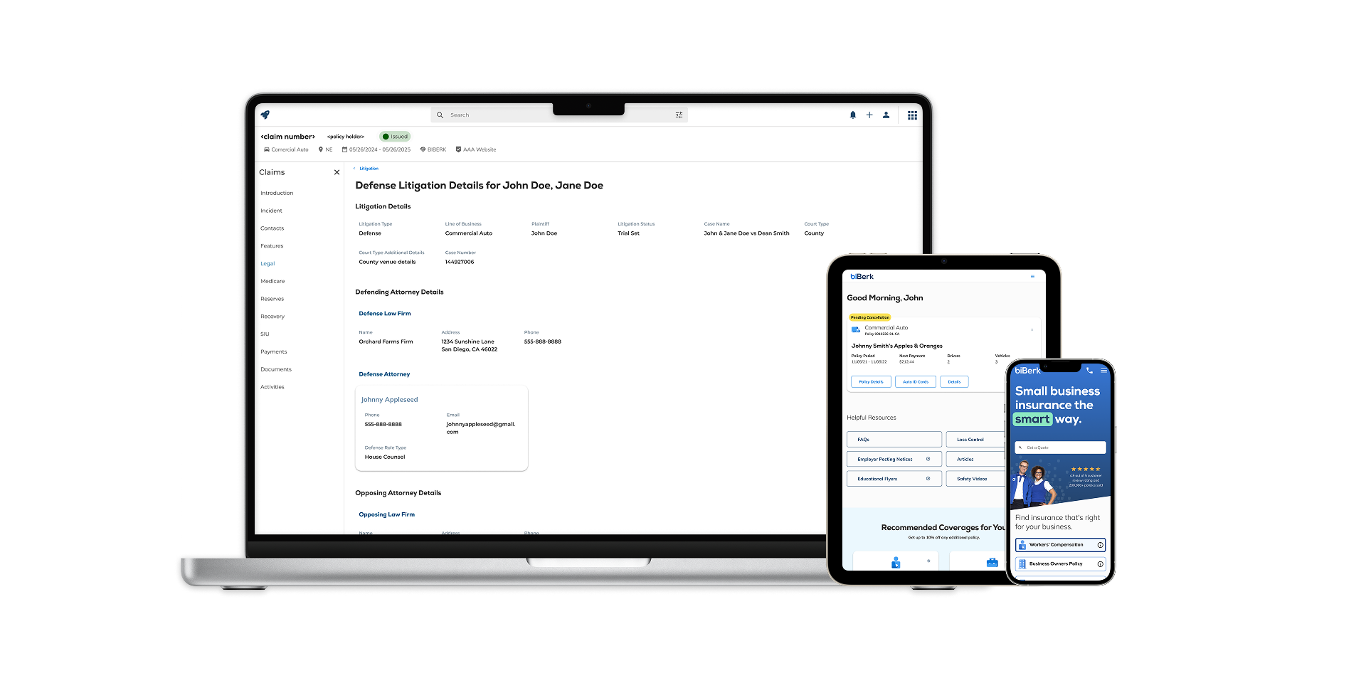
Beyond workflow improvements, the design system also helped establish a far more cohesive and recognizable visual language across biBerk’s growing suite of products, contributing to a stronger sense of consistency and brand trust for users. The system has already been successfully implemented across the company’s marketing website, the My Account customer portal, and internal tooling. Additional legacy lines of business are currently being migrated to the new system as the company continues consolidating its digital ecosystem under a singular unified design foundation.